Creating a free JAMstack website with Nuxt.js, Tailwind CSS, and GitHub Pages


After finishing up my Java development bootcamp, I decided to begin developing a professional presence online by creating a website. Given how many options there are for creating a website nowadays, I first had to reflect on what was important for me to consider before starting development. As a recent graduate, my foremost design consideration was to avoid spending money (I had none). Furthermore, I wanted to focus on using popular technologies with a promising future because of an architectural principle called "LIS" (Life is Short). Programming offers enough tutorials, workshops and guides to wander off in a desert for forty years in search of a promised land of technical perfection. So, I wanted to start building something as quickly as possible.
JAMstack: What and Why?
JAMstack is a relatively new trend in the web development world, but it perfectly met my criteria for a popular technology with a promising future. JAMstack was an idea founded by the maker of Netlify, a company that proposed an innovative and powerful way of building websites. The premise of JAMstack is that we can prebuild webpages (static site generation) and serve them as they are needed with a Content Delivery Network (like Netlify, GitHub Pages or the recently released Cloudflare Pages). This way, we limit rendering content to only when it is absolutely necessary, like making an API call. It provides a clear decoupling of a website's components, and it makes websites cheaper and faster. All of the Content Delivery Networks offer a free tier, but I chose GitHub Pages because of the simplicity of storing and deploying code in the same place.
Building a foundation: a domain + GitHub Pages
Thanks to the GitHub Student Developer Pack, I was able to use Namecheap to get a free domain for my website. From my research it seemed there would be no SEO impact by using a free .me domain rather than buying a .com domain. I took jacobhabib.me and it was simple to configure my domain with GitHub Pages using these instructions. Once the domain and GitHub Pages are configured it is as easy to deploy as specifying which branch to build from.
Programming with Nuxt.js and Tailwind CSS
Sometimes it feels like there are more frameworks in programming than there are programmers who are willing to maintain them. Worse, sometimes frameworks come into the world just to disappear into obscurity (AngularJS, Java Swing, etc.). Though learning a new framework can feel like entering into a doomed relationship, I decided to use Nuxt.js and Tailwind CSS because they are a great fit for JAMstack architecture and resulted in much quicker development.
Nuxt.js is an open source Vue framework that provides out of the box static site generation--the essence of JAMstack. I followed these instructions to create a basic Nuxt.js project in VS Code. For the configuration I chose the following options:
1) Package manager: Yarn
Yarn is significantly faster than the bulky npm package manager and is rapidly gaining popularity
2) Programming language: JavaScript
I chose JavaScript over TypeScript because I have experience in JavaScript and did not want to take on more frameworks than I have arms in a single project. Though, TypeScript is regarded as a more powerful superset of JavaScript
3) UI Framework: Tailwind CSS
4) Nuxt.js modules: None
5) Linting tools: Any of these are good but I like ESLint
6) Testing Framework: None
7) Rendering mode: Universal (SSR/Static)
Accord to the Vue.js docs, SSR rendering is superior to SPA (single-page application) rendering because of better SEO results and page loading times. Though, there are tradeoffs to each that you can read about here .
8) Deployment Target: Static (Static/JAMstack hosting)
9) Developments Tools & 10) Continuous Integration: None
Why Tailwind CSS?
Tailwind CSS is a CSS framework that makes the styling part of web development much easier. Regular styling in CSS involves endless scrolling between HTML and CSS code and needlessly creating names for different elements of your website (no more ".left-side-little-banner-under-medium-banner"). Tailwind CSS allows styling right into the HTML and it makes it simple to extract re-used parts of a website into a component. For example, my navbar became the Navbar.vue component that I can inject into every page of my website.
Strategy Time
Before editing your newly generated index.vue page it may save you a couple of hours to learn from some of my mistakes when I was building out my homepage.
1) Mobile-first design: Tailwind CSS is a strong proponent of mobile-first design. Be sure to have a mobile and desktop version of your website open on your local development environment and include Tailwind's breakpoints ("sm", "md", "lg", "xl", "2xl") if needed to ensure you will not develop a totally mobile-incompatible website just to have to tear it down
2) Extracting components: If you know you'll have to re-use an element of your website just extract it into a component and inject it into a webpage so you can avoid restyling it every time. It's so simple to use a component. You can throw it into the script of a page then simply refer to it in the HTML with a name like <Navbar />
<script>
import Navbar from '../components/Navbar.vue'
export default {
  components: { Navbar },}
</script>
3) Flexbox vs. Grid: Before creating any elements of a webpage it is best to decide how to organize them. Flexbox is a row-based way and grid is a row and column-based way to organize content. I used flexbox because I had less experience in it and wanted to experiment. The general rule is that CSS grid is for layout-first design and flexbox is for content-first design. Either way it takes a lot of experimentation to make things look right, but Tailwind CSS has features that make this a lot easier.
Page Headers
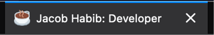
Before building the first page, it is helpful for SEO purposes to ensure page headers are configured correctly. We can configure page headers on a per page basis but for a simple site it may just be easiest to set them globally. We can specify the header information we want to include in the nuxt.config.js file. You can set a custom favicon for a website (mine is a coffee cup) by replacing the favicon.ico file under the static folder with your own. Here is my header configuration, what appears in search, and what shows up in a browser tab:
// Global page headers (https://go.nuxtjs.dev/config-head)
  head: {
    title: 'Jacob Habib: Developer',
    htmlAttrs: {
      lang: "en",
    },
    meta: [
      { charset: 'utf-8' },
      { name: 'viewport', content: 'width=device-width, initial-scale=1' },
      { hid: 'description', name: 'description', content: 'Hello! My name is Jacob Habib. I'm a developer from Cincinnati, Ohio'}
    ],
    link: [{ rel: 'icon', type: 'image/x-icon', href: 'favicon.ico' }]
  },

Coding the First Page
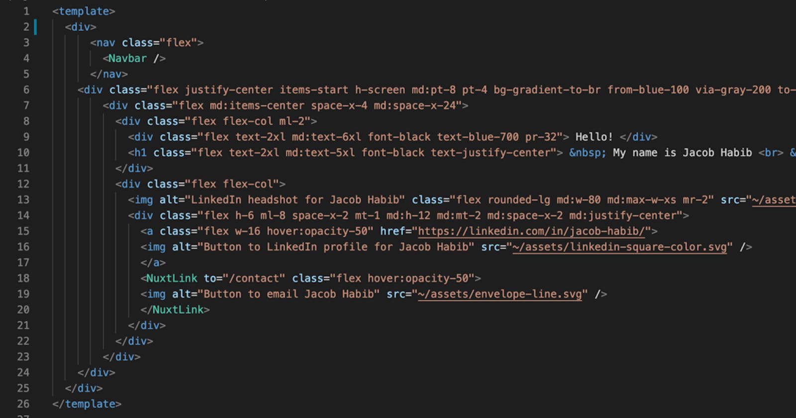
Every Nuxt.js page will include a template, script and style section. The template section will include HTML and Tailwind CSS code, the script section includes JavaScript, and the style section is mostly optional if using Tailwind CSS, but it does allow you to style with CSS if you need to break from the framework. Below is the code for the first page of my website:
<template>
<div>
<nav class="flex">
<Navbar />
</nav>
<div class="flex justify-center items-start h-screen md:pt-8 pt-4 bg-gradient-to-br from-blue-100 via-gray-200 to-blue-200">
<div class="flex md:items-center space-x-4 md:space-x-24">
<div class="flex flex-col ml-2">
<div class="flex text-2xl md:text-6xl font-black text-blue-700 pr-32"> Hello! </div>
<h1 class="flex text-2xl md:text-5xl font-black text-justify-center"> My name is Jacob Habib <br> I'm a Developer <br> Based in Cincinnati, Ohio</h1>
</div>
<div class="flex flex-col">
<img alt="LinkedIn headshot for Jacob Habib" class="flex rounded-lg md:w-80 md:max-w-xs mr-2" src="~/assets/headshot.jpg" />
<div class="flex h-6 ml-8 space-x-2 mt-1 md:h-12 md:mt-2 md:space-x-2 md:justify-center">
<a class="flex w-16 hover:opacity-50" href="https://linkedin.com/in/jacob-habib/">
<img alt="Button to LinkedIn profile for Jacob Habib" src="~/assets/linkedin-square-color.svg" />
</a>
<NuxtLink to="/contact" class="flex hover:opacity-50">
<img alt="Button to email Jacob Habib" src="~/assets/envelope-line.svg" />
</NuxtLink>
</div>
</div>
</div>
</div>
</div>
</template>
<script>
import Navbar from '../components/Navbar.vue'
export default {
components: { Navbar },}
</script>
Since this is an article, it will be easier to talk about building out the page like a puzzle rather than explaining every Tailwind CSS label in detail. As with every page of my site, I injected a Navbar.vue component at the top of the template section. My Navbar.vue file is tucked away in my components folder and looks like this:
<template>
  <nav class="flex w-full justify-center py-3 md:py-4">
    <div class="flex text-md md:text-lg space-x-6 md:space-x-16">
      <NuxtLink to="/" class="flex hover:text-blue-700">Home</NuxtLink>
      <NuxtLink to="/about" class="flex hover:text-blue-700">About</NuxtLink>
      <NuxtLink to="/projects" class="flex hover:text-blue-700">Projects</NuxtLink>
      <NuxtLink to="/blog" class="flex hover:text-blue-700">Blog</NuxtLink>
      <NuxtLink to="/contact" class="flex hover:text-blue-700">Contact</NuxtLink>
    </div>
  </nav>
</template>

<script>
export default {
  name: "Navbar",
  computed: {
    currentRouteName() {
      return this.$route.name;
    }
  }
}
</script>
NuxtLink is the Nuxt.js implementation of RouterLink in Vue.js. Simply put, it is like the <a> tag in HTML but it provides routing between pages that are within your project. More detailed information is in the docs. On the homepage, the nav bar can be injected into the HTML in a <nav> tag right beneath the <div> that wraps everything in the page:
<template>
  <div>
      <nav class="flex">
        <Navbar />
      </nav>
  ...
  </div>
 </template>
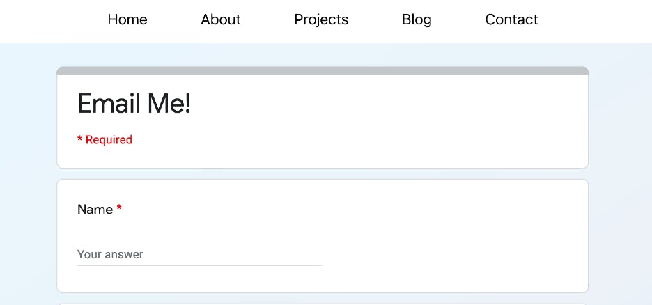
Notice that for the images and icons that we want to include on the homepage, we can throw them into the assets folder of our project directory and then provide their relative paths in the HTML. I use NuxtLink to route a letter icon to my contact page. Originally, I was going to put my email into the HTML so that the icon would open up my email directly, but I was warned that web scrapers can easily take an email from a website this way. So, it may be best to embed a Google Forms survey into a page and have that forward a message to your inbox.
This is the code for the LinkedIn icon and the message icon that links to the contact page:
             <img alt="Button to LinkedIn profile for Jacob Habib" src="~/assets/linkedin-square-color.svg" />
              </a>
              <NuxtLink to="/contact" class="flex hover:opacity-50">
              <img alt="Button to email Jacob Habib" src="~/assets/envelope-line.svg" />
              </NuxtLink>
And this is what the embedded Google Forms survey looks like:
The actual content of the homepage of your website will require a lot of trial and error with Tailwind CSS labels, but I will walk through the labels of a particularly Tailwind-heavy HTML element, which is how I created a background gradient.
<div class="flex justify-center items-start h-screen md:pt-8 pt-4 bg-gradient-to-br from-blue-100 via-gray-200 to-blue-200">
flex: specifies that an element is a flexbox
justify-center: justifies items against its container's main axis
items-start: aligns items at the start of the container's cross axis
h-screen: the element spans the height of the viewport
md:pt-8: on medium screens and larger add 2rem of padding to the top of the element
bg-gradient-to-br: linear gradient to bottom right
from-blue-100/via-gray-200/to-blue-200: these specify the colors of the gradient. Tailwind provides various levels of darkness for colors for simplicity sake but these can be customized
Analytics
After finishing the website, I struggled to find a way to extract simple analytics, like the number of visitors to my website. I found a great tutorial here on adding Google Analytics to a Nuxt.js project using vue-gtag. The Nuxt.js community has been trying to juggle supporting Google Analytics, Google Tag Manager and Google's global site tag (gtag.js) so this may be why the vue-gtag package is preferred for now over a Nuxt.js package. Google Analytics is the most powerful and customizable analytics provider that I found, but if I were planning to monetize a site, I would love to experiment with Plausible's open-source, privacy-oriented platform. Their cloud-based solution starts at $6 per month but if you want to spend some time in Docker you can self-host for free.
Areas for Improvement
I could have spent another decade optimizing all of my Tailwind CSS tags and perfecting the website, but because of the LIS principle and all of the new projects waiting to be started, I decided it would be wise to move on from the website. Deciding to leave a project stirs up many "could have" and "should have" thoughts. I hope by sharing them here some planning could improve someone else's development experience:
1) Wonky formatting at certain screen sizes
Because I originally built the website without mobile-first thinking, I had to break down a lot of parts and rebuild. The website is not 100% compatible on every screen. The images can grow unusually large and the homepage icons can become shrink and become misaligned. I noticed that images may render differently on the development environment versus on the internet. Maybe some edge case compatibility issues between Tailwind CSS and Nuxt.js?
2) Useless and unorganized labels
When adding more and more Tailwind CSS labels to an element, it is not clear when there is a conflict between two labels or even when one label overrides another. I often deleted random labels only to find that nothing changed. When adding new labels to an element it may be helpful to look for duplicates in child elements and remove labels to see if it results in any visible difference. Also, the order in which labels are added can feel like mixing a potion without knowing which ingredients to add first. It is a little confusing to look at labels that are in no particular order.
3) "Contact me" form implementation
Embedding a Google Forms survey means embedding an iframe. It takes forever to load, which defeats the purpose of serving prebuilt webpages. If I were to create another contact form, I would have just built a lightweight form that sends the data to an API endpoint. Or maybe an API that will also serve the form itself? Or a plugin? Any of these are probably better than putting an email into the HTML.
4) CDN
Cloudflare Pages was not released when I started building my website. I certainly would have gone with it if I were to start again tomorrow. Cloudflare's network is extremely fast, it has its own analytics platform, free DDoS protection (necessary if using an API), and Cloudflare Workers looks like a great solution to integrate the back end of the website.
Conclusion
I hope I provided enough information for anyone to understand the flow of how I built my simple professional site. It was my first attempt at building a JAMstack website and I wanted to document as I went through the project with the hope that it would be useful or inspire ideas for someone else. If there are any mistakes or if you have any questions for me feel free to let me know in the comments! I love meeting other developers so here are some places where you can get or stay in touch with me:
Twitter: twitter.com/jahabeebs LinkedIn: linkedin.com/in/jacob-habib